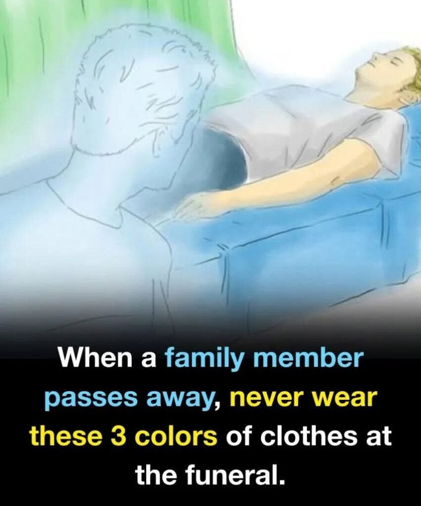
Here are 3 colors you should generally avoid wearing to a funeral, along with why they’re considered inappropriate in most cultures. (There are exceptions, which I’ll note.)
1. Bright Red
Red is the biggest no-go at funerals.
Why to avoid it:
-
Symbolizes passion, celebration, or romance
-
Draws attention to the wearer
-
Can feel disrespectful in a solemn setting
In some cultures, red is associated with weddings or festivals—not mourning.
2. Neon or Extremely Bright Colors
Think neon green, hot pink, bright orange, or electric yellow.
Why to avoid them:
-
Appear flashy or celebratory
-
Distract from the purpose of the gathering
-
Can be interpreted as insensitive
Funerals are about remembrance, not standing out.
3. White (In Many Western Cultures)
This one depends on culture.
Why white can be inappropriate:
-
In Western cultures, white is linked to weddings and celebrations
-
May appear too formal, bridal, or symbolic of joy
⚠️ Exception:
In many Asian cultures (such as Chinese, Korean, and Indian traditions), white is actually the traditional mourning color. Always consider cultural customs.
What Colors Are Usually Appropriate
When in doubt, choose:
-
Black
-
Dark gray
-
Navy blue
-
Charcoal
-
Dark brown
Muted, neutral tones are always safest.
Quick Etiquette Tips
-
Choose simple, modest clothing
-
Avoid flashy accessories
-
Keep makeup and fragrance minimal
-
Comfort and respect matter more than fashion
Bottom Line
A funeral isn’t about personal expression—it’s about respecting the deceased and supporting loved ones. When unsure, understated and neutral is always the right choice.